In my humble opinion, Google’s Pixel phones have the best software of any smartphone.
Yes, I did argue back in March that Samsung’s One UI 7 had the upper hand, but Android 16 on the Pixel 10 Pro XL has restored Google’s crown. Apple’s iOS 18 couldn’t compete, and I highly doubt that’ll change with iOS 26.
It’s not a particularly controversial opinion. Many, especially those who use Android on a regular basis, would agree that the Pixel 10 series is as good as it gets for software.
Google’s approach has a lot going for it. It’s slick, intuitive and easy to use, even for someone who’s not familiar with Android. Bloatware is kept to a minimum, and most of it can easily be uninstalled. And if you primarily use Google apps and services (as I do), they interact seamlessly with one another.
That’s before you even get to the prompt updates, monthly patches and seven years of software support. It’s an enviable package.
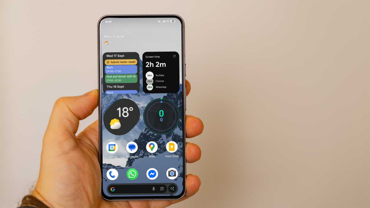
However, I believe that there’s one big area that Google is neglecting: the home screen. As the first thing you see when you unlock your phone, you’d think that the company would pay special attention to it, but that’s not the case.
In total, there are four significant shortcomings that frustrate me every time I use a Pixel phone. Google’s apparent stubbornness makes me tempted to switch long-term.
Foundry | Alex Walker-Todd
What if I don’t want to glance?
Since the Pixel 2 series in 2017, Google’s phones have included a widget known as ‘At a Glance’.
As the name suggests, this allows you to get a quick look at key information by simply glancing at it. Most of the time, this is simply the date and current weather, and tapping each of those sections will open the relevant app.
It will also display upcoming events in your calendar, traffic and flight updates, charging status (including for wireless earbuds), air quality and weather alerts and more. As far as widgets go, it’s one of the more useful ones.
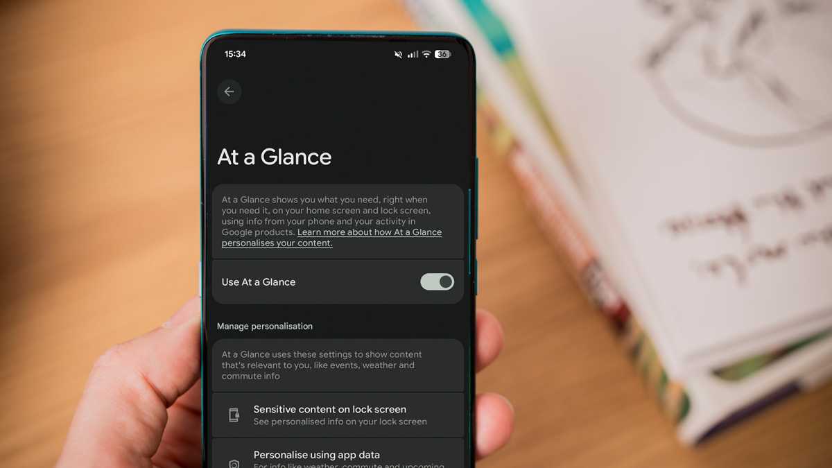
My issue with At a Glance isn’t the information isn’t the information it shows, or even the way it displays it (even though crucial details are often cut off), it’s the fact that you can’t remove it. Try as you might, At a Glance will remain a permanent fixture of the home screen. You can’t even move it around!
Within its settings, you’ll find a ‘Use At a Glance’ toggle. However, this simply turns the widget into a passive date display, removing all the other useful information.

Foundry
The misery is compounded when the widget supposedly takes up the entire top portion of the screen, despite no information ever being shown on the right side. It doesn’t help that At a Glance hasn’t had a visual upgrade in eight years and is now looking decidedly dated.
The only real solution is to download and use a different launcher. But this changes more than just the home screen, and I really like the rest of the Pixel software experience.

Foundry
Stop the search
Google is best known for its search engine, and the company seems intent on reminding you every time you unlock your Pixel phone.
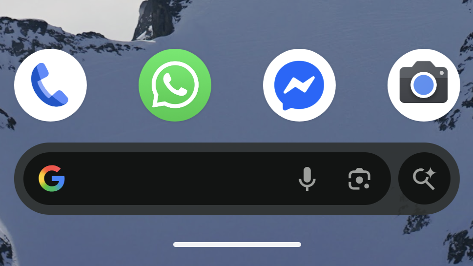
That’s the only explanation I can give for the big old search bar at the bottom of the screen. I get it, you don’t want people jumping ship to Bing or DuckDuckGo when they boot up their web browser, but how likely is that really?
In total, I used the Pixel 9 Pro XL for around five months and have spent another four weeks with its successor, the 10 Pro XL. During that time, I haven’t intentionally used the search bar once! However, given that it’s taking up prime real estate at the bottom of the screen, it’s received its fair share of accidental presses.

Foundry
It’s pretty clear that Google doesn’t care about the search bar, anyway. The company might have added a shortcut to the new ‘AI Mode’ in recent months, but a tap of the microphone still launches Google Assistant! Given how established Gemini, its AI-powered replacement, now is, this is a laughable decision.
Just like At a Glance, you can’t move or resize it in any way. Its colour will match your system theme, but that’s where the customisation ends.
Lamentable labelling
App labels can be very useful. If you’re unfamiliar with an app icon, or are looking for something in an alphabetical app drawer, it makes sense to see the name.
However, that doesn’t apply to the home screen. On that front page, you’re only putting apps that you actually use on a regular basis (or you should be). Unless they’ve recently had a redesign (unlikely), you’ve probably seen the icons hundreds, if not thousands, of times. The labels below them are pretty redundant.

Anyron Copeman / Foundry
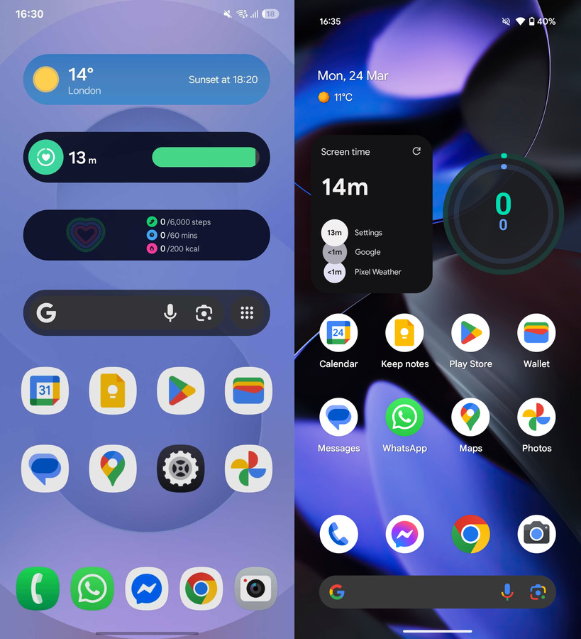
Google has recognised this in the app dock, but for some reason, it doesn’t apply the same logic to the main home screen. I’m not asking for a universal removal – just give us the option to turn them off!
I’d be less critical of Google’s stubbornness if you could fill the rest of the space with gorgeous first-party widgets. Sadly, that’s not the case.
The Pixel isn’t short of home screen widgets, but they’re a little…how shall I put it…. functional. You can easily manage your calendar, check the weather forecast or see how many steps you’ve taken from the home screen, but they lack polish and struggle to blend in with the app icons and annoying At a Glance.

Foundry
Compare that to Samsung, which offers plenty of attractive ones out of the box, and Google’s lack of effort here is magnified. You can find some great options by using third-party apps, but that shouldn’t be necessary.
The same can be said for all the shortcomings mentioned in this article. If you get a Samsung Galaxy phone running One UI 7 or 8, you won’t have to worry about any of these.
I still think the Pixel has the slight upper hand overall, but if Android really is the home for customisation lovers, Google needs to stop digging its heels in and let us properly tweak the home screen to our liking.


