
Right now, the whole tech world is talking about last night’s major Apple event.
Among the many products it debuted, the keynote will be most remembered for ushering in the all-new iPhone Air as well as the massively revamped iPhone 17 Pro. If there’s one thing it brought to my mind, however, it was confirmation of what I’ve long known in 7+ years as a tech journalist: the only good colourway is a green one.
At this point, black and white colourways are overdone – they’re just expected, so any injection of colour that might make a phone a bit more eye-catching is always welcome, especially the very tasty Cosmic Orange of the iPhone 17 Pro.
Apple
However, for all the options that are available, you won’t convince me that anything looks quite as stylish as a hint of mint or a full-on dip into the palette of a forest, the best example of which can be found on the green iPhone 13.
I’ve been an iPhone fan for years now, but that green model of Apple’s 2021 handset is a true beauty. I don’t think it’s a surprise that Apple reintroduced a green option to some degree immediately after having it disappear for a year with the iPhone 14.
Even now, the Sage colourway of the iPhone 17 (shown third from the right below) stands out from the pack as being far more visually arresting than any of the other choices.
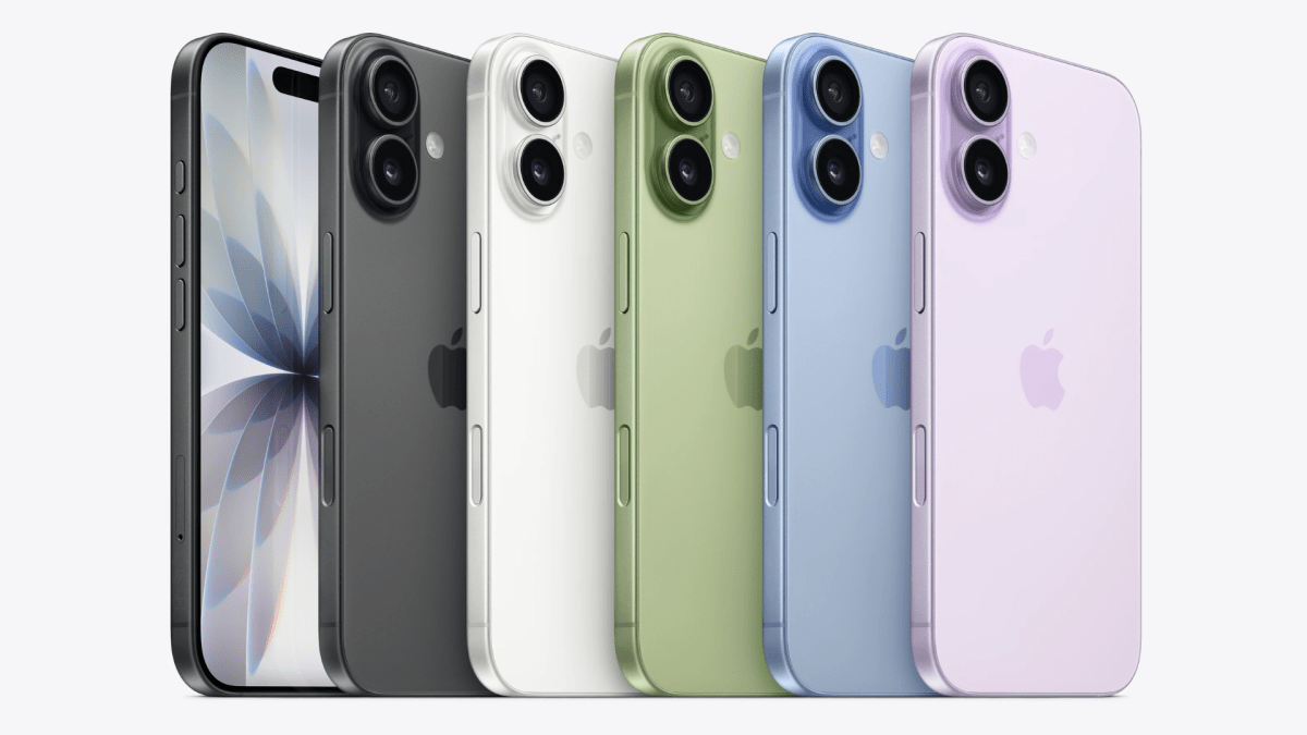
Thomas Deehan / Foundry
Oddly enough, the iPhone Air feels like a prime example of how not to design a smartphone. Don’t get me wrong, the phone is technically impressive – being able to have an iPhone that’s only 5.6mm thick is a true feat of engineering, and I’ll be interested to see if the concept takes off with the general public. But you can’t tell me that the iPhone Air colours spark any kind of joy.
You can’t tell me that the iPhone Air colours spark any kind of joy
The Space Black option is probably the only exception, but if you look at the Sky Blue, Light Gold and Cloud White designs long enough, they start to blend into the same dull tone that only hints at the slightest whisper of colour. If I were to pick one up at launch, I’d want to slap a case on the thing right from the jump (though that would probably defeat the point of having such a slim phone).
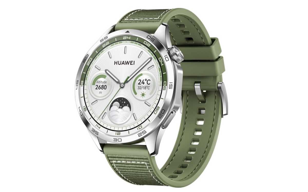
All of this is to say that I wish more companies would adopt exciting colours when it comes to tech. The Forest Green option of the Huawei Watch GT 4, which came out back in 2023, is still the best-looking smartwatch I have ever used, and in an industry where specs can blur together as companies vie to have the faster chipsets out there, style can account for a great deal.
Amazon
In the meantime, I’m going to be flying the green flag for every piece of tech I review, but the real thing I’d love to see is for companies to embrace the colour spectrum again – devices are just a lot more fun when you find yourself looking at more than the screen alone.


